Graphic Design That Converts: Lessons from Real Estate Marketing
Graphic Design
How information hierarchy, color psychology, and aspirational design work together to turn a cluttered property ad into a lead generation machine.

Mar 8, 20265 min read
Graphic Design That Converts: Lessons from Real Estate Marketing
Real estate marketing presents one of the most complex design challenges in the industry: you need to communicate dense technical information (pricing, square footage, location, amenities, legal terms, special offers) while simultaneously evoking an emotional "dream home" response in the viewer. These two objectives are naturally in tension.
Information overload is the single biggest failure mode in property advertising. When a buyer sees a ad packed with text, pricing tiers, and offer conditions, the brain defaults to the easiest available action: scroll past. The design challenge is therefore not "how do we fit all this information in?" but "what is the one thing a casual scroller needs to see in the first two seconds, and how do we make sure they see it?"
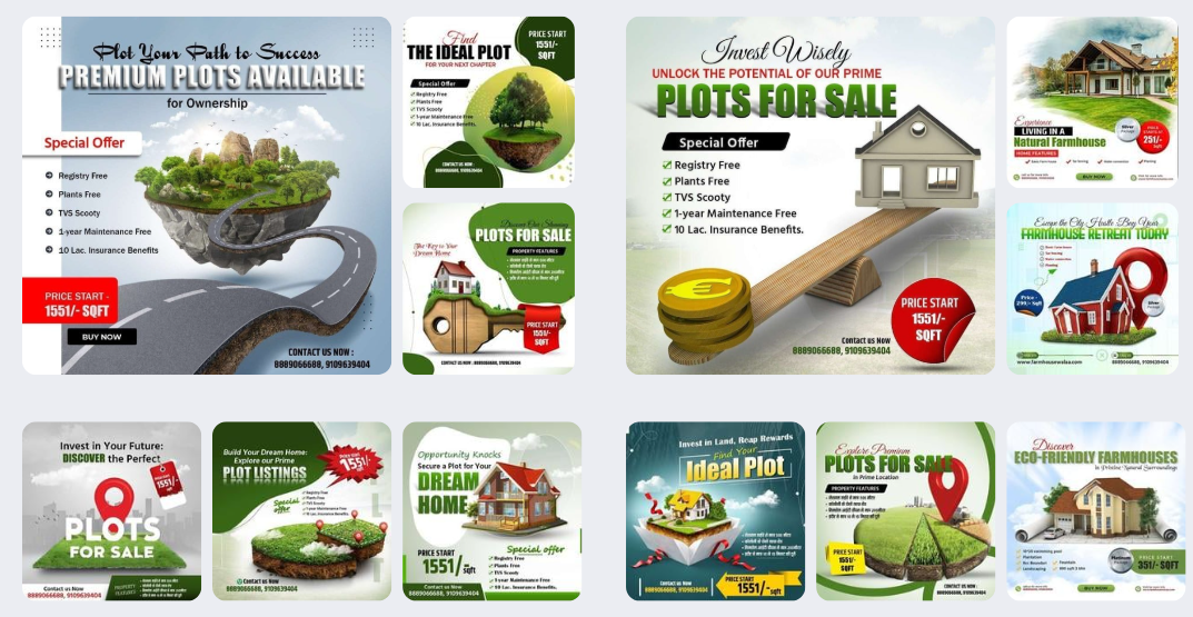
For our work with a premium land plot developer, we established a rigid visual hierarchy: the price per square foot in the largest possible type, a single "key benefit" statement (e.g., "Registry Free"), and a clear call-to-action button. Everything else — the full amenities list, legal details, project specifications — lives at the second level of attention, visible to engaged viewers but not competing for initial attention.
Color psychology plays a surprisingly significant role in real estate advertising. Our research found that "Earth Green" paired with "Trust Blue" produced the highest lead-form submission rates — green signals growth and natural living, while blue communicates stability and trustworthiness, both critical emotions for high-value property purchases.
The visualization style also matters. Our testing showed that 3D isometric illustrations of plots and buildings performed significantly better than flat site maps. Isometric views help buyers "see themselves in the space" — they can visualize the path from the road to the plot, the relationship between buildings, and the overall scale of the development. This spatial comprehension directly reduces friction in the decision-making process.
The campaign for this client generated a 45% increase in qualified lead inquiries within 60 days. The design system was later adapted for on-site billboards and print brochures — a seamless "Online to Offline" brand experience that maintained consistency across every buyer touchpoint.
Simbolo Studio
Design Lead - Simbolo